Debra Dick for Nouveau Bleu
Meet the Illustrator Behind Nouveau Bleu!
At the turn of the 19th century, the artist Alphonse Mucha was at the height of his career. He was celebrated for his commercial work that advertised everything from chocolate to soap and his idealized female figures that were often based on Parisian film stars and glitterati. His portraits were printed as large-scale posters heralding all of the new advances in printing. His color palette was often the rich, warm, pastel tones of photographs and he used these hues to create Mucha women with flowing hair that matched the flourish of his gorgeous lettering and typefaces.
Within this range of color emerges a signature eau de nil blue that Mucha used to clothe the women in lush drapery, illuminate the skies behind them, give them wings and surround them with waves of water.
Our newest addition to the core range of Esterbook Estie’s, the Nouveau Bleu, celebrates the innovation of Mucha’s work and his particular shades of blue, blended into a material that reflects the celluloid of pen making past.
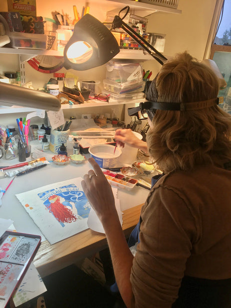
To help us introduce the Nouveau Bleu, we turned to Debra Dick to create a painting that incorporated the influence of Mucha and our new Estie, using her decades long career as a calligrapher, artist and instructor.
We sat down with her to discuss her love of art and calligraphy, her process for creating this new work of art to celebrate the Nouveau Bleu and what inspires her.
When did you first start having an interest in lettering and drawing?
I’ve really had a lifelong obsession with art. I remember from the time I was a little girl, I wanted to be an artist. In the sixth or seventh grade I got into handwriting. My Mom wrote in the Palmer method and that was also an influence for paying attention to lettering.
In grade school I had a teacher who had the most amazing signature. It really struck me to see it on the blackboard. At home, I would write my notes in cursive and rewrite them to practice. The added benefit of doing this was that the muscle memory of copying was that it helped me get good grades.
I didn’t go to college for art even though I wanted to. During my senior year, there was a course offered in Italic calligraphy. This was a turning point for me. It led me to the guild system of calligraphy. I was the youngest member of the guilds. At the time, this was primarily how calligraphy was being taught. I was so inspired by others’ work and the result of this inspiration is that I became an instructor within the guilds and have been teaching for twenty plus years.
For a long time, there was a concern that calligraphy would die. But in the last five to ten years, we have seen a change in the diversity of students and calligraphy itself. Young people being a part of this craft is so important, because writing by hand is the last bastion of creativity. We are meant to use our hands to create and screen time is not a replacement for that. It’s exciting to have new interest in calligraphy and it’s important for those who are new to it to understand that it is a slow craft that takes years of practice, but that there is so much fun and so much to be learned in those years.
How did you approach the project for Nouveau Bleu?
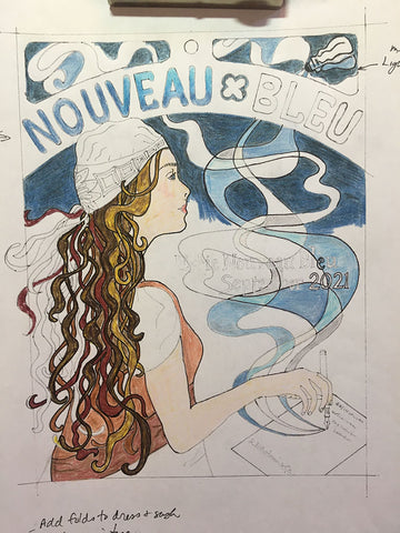
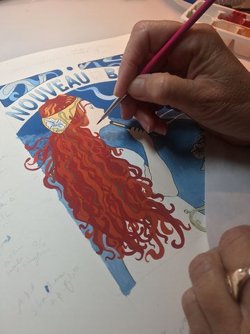
I knew of Alphonse Mucha but hadn’t studied him. Revisiting his work, I was just blown away by the beauty of it. I didn’t want to copy his work, but I wanted to fuse together his design aesthetic with my own signature. Everything that he did was so tight and beautiful with relation to his designs so that was something to aspire to.
I started with several thumbnails to understand how I wanted to approach the subject and the placement within the painting. I did lots of trial and error and manual cutting, pasting, and overlaying before committing to the actual piece. At one point I even traced the hair of one of Mucha’s women, just to get the feel of it. He makes it look easy and it is such an important part of his works, that I wanted to get it right. It was difficult, so having an understanding of the motion of how he executed the hair was crucial. I looked at artwork from the 60’s and 70’s that was influenced by and copies of Mucha. I was also inspired by a photograph of Farrah Fawcett’s hair which had the most perfect curls! I looked carefully at Mucha’s color schemes, which are so gorgeous. In some of his illustrations he has the reds, browns and golden blonds that became my color palette. All together these influences helped me create my modern Mucha girl.
Are you a fountain pen enthusiast and if so, which pen you most enjoy using?
I’m trained to use pens with interchangeable nibs, so that is my go-to. I’ve never specialized in one hand of calligraphy so having a large variety of nibs is important.
I do have some fountain pens that were my uncles that I enjoy using to write letters.
I love using a brush and sumi ink. It offers such freedom, and it is a wonderful feeling.
Of course, there is also nothing like a quill on vellum.
What inspires your art?
I began an illustrating journal that has been healing for myself during the pandemic. In recent years I’ve become really interested in studying indigo ink and Shibori dyeing.
After so many years of the tight, perfectionist work of a calligrapher, I am really excited about mark making in a more organic way, so for the past two years that is what I have been doing.
I’ve taught over 3000 students in my career and I’m looking forward to creating some new workshops. I’m about to go take a course and get inspired by the thoughts, stories and poems of Italy.
I’ve also always been inspired by nature. It has always been a muse for me and even more now. I have come to really appreciate where we live and to be able to walk and be outside in such beautiful surroundings.
nature inspired and place